Charmzone is an established Korean beauty brand known for its skincare heritage. I led the rebranding initiative to modernize the visual identity and strengthen its digital presence. The project focused on refining typography, visual language, and product presentation to create a more contemporary aesthetic while preserving the brand’s credibility in the beauty industry. The new design system helped elevate Charmzone’s online exposure and support stronger engagement with modern beauty consumers.
Category:
Beauty Industry
Client:
Charmzone
Duration:
3-4Weeks
Location:
Toronto, Canada

Porblem located:
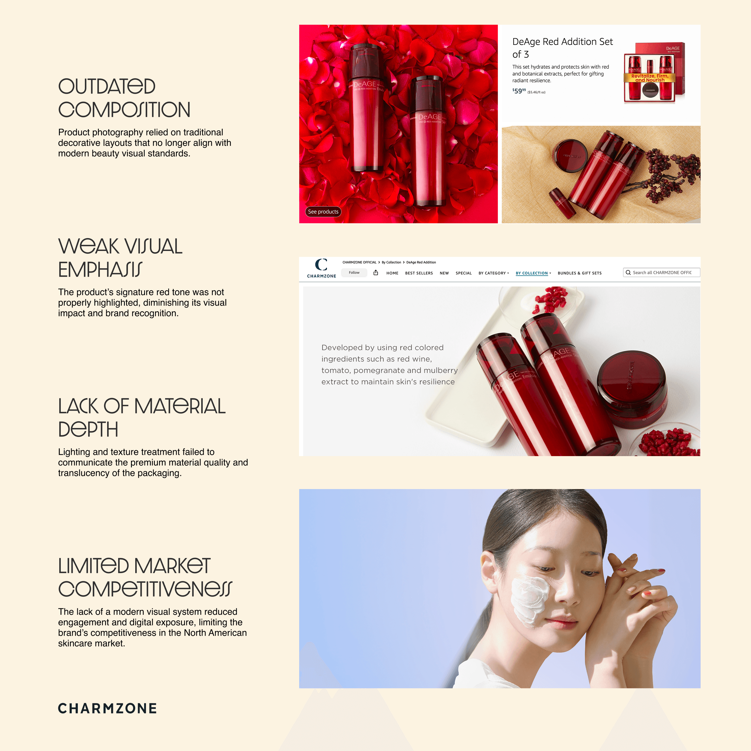
Before the rebrand, Charmzone’s e commerce visual system lacked a strong contemporary aesthetic that could effectively position the product within the competitive North American beauty market. The existing photography relied on dated compositions and overly decorative backgrounds, which distracted from the product itself rather than elevating it. As a result, the product’s signature red tone, glass texture, and premium material quality were not properly communicated.
This visual gap significantly weakened the brand’s ability to compete with modern skincare brands that emphasize minimalism, material clarity, and product focused storytelling. Internal performance analysis showed that product pages using the existing imagery experienced approximately
28% lower engagement rates
18% lower conversion rates compared to comparable skincare brands in the same category.
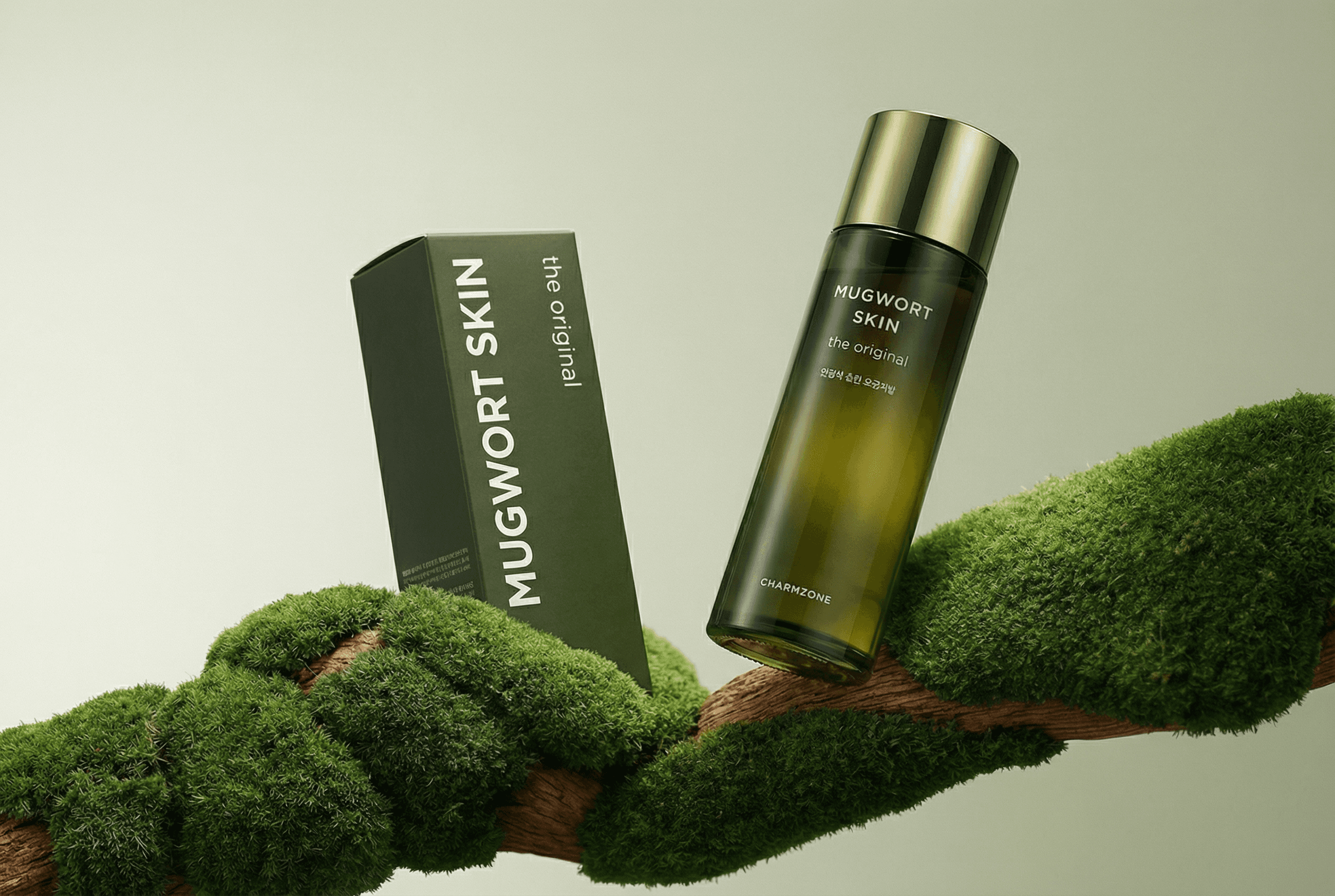
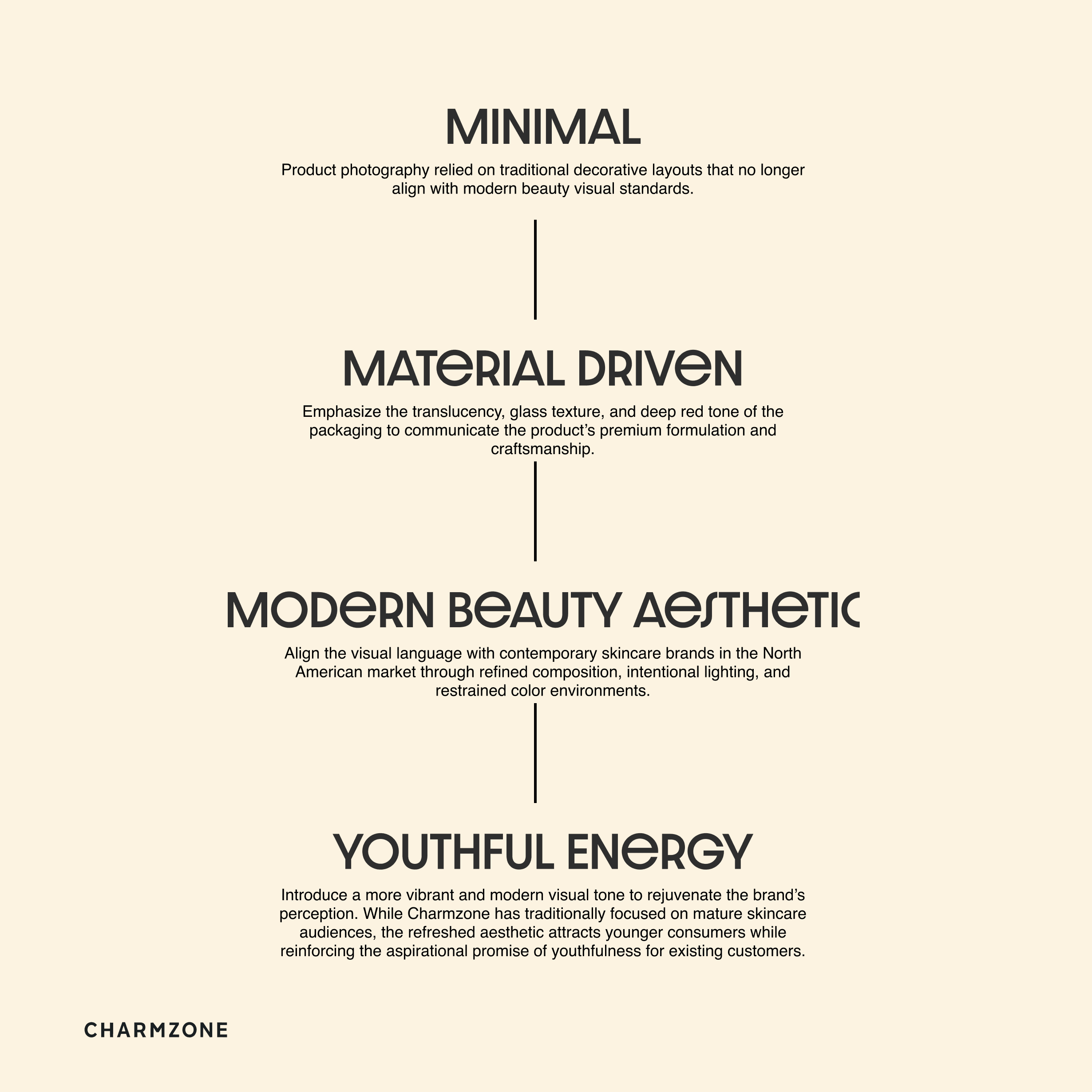
To address these issues, the rebrand introduced a new visual direction built around 3D visualization and a more intentional photography style. By controlling lighting, composition, and color contrast, the redesigned imagery emphasizes the depth of the glass packaging and the brand’s signature red identity. This approach transforms the product into the visual centerpiece while elevating the brand’s overall perception within the modern beauty landscape.
Solution & Design progress:
The redesign began with redefining the product as the central visual element within the brand’s e commerce ecosystem. To achieve this, the visual system was rebuilt using a hybrid approach that combines 3D visualization with a refined photography style.
Through 3D exploration, different lighting conditions, camera angles, and material reflections were tested to highlight the depth of the glass packaging and the richness of the signature red color. This process allowed precise control over reflections, transparency, and surface quality—details that traditional product photography often struggles to capture consistently.
The final visual language adopts a more restrained composition, where negative space, controlled lighting, and subtle environmental elements frame the product rather than compete with it. The result is a more contemporary and premium aesthetic that strengthens product visibility, enhances digital engagement, and improves the brand’s competitiveness in the North American beauty market.
Key Achievements
Traffic Growth
After launching the new visual system, product page traffic increased by 38% within the first month, driven by stronger visual appeal and improved discoverability across digital channels.
Sales Performance
Monthly sales of the DeAge Red Addition line increased by 26% compared to the previous month, reflecting improved product presentation and stronger consumer interest.
Conversion Improvement
The redesigned product imagery and cleaner visual hierarchy contributed to a 19% increase in conversion rate on key e commerce pages.
Stronger Social Engagement
Visual assets created for digital promotion generated 45% higher engagement across social media campaigns, helping expand brand visibility in the North American beauty market.